By Frankie Blake Greenslade
Colourists are behind the mood and look of a film, but they aren’t given enough credit for their craft – the art of colour grading. These professionals are involved in the post-production process, using digital colour grading to alter the luminance levels (brightness) and chroma (colour) of the final cut to achieve the specific palette intended by the director and director of photography (DP).
The evolution of cinema from black-and-white to Kinemacolour (1908-1915) and later Technicolour was pioneered by early film colourists. George Albert Smith was the first to produce a natural colour motion picture system (Kinemacolour), alternating red/orange and green/blue filters onto black and white stock which recreated colour by projecting the film through red and green spinning discs. Early films using this technique include Charles Urban’s Our King and Queen Through India (1912), though much footage from these films has been lost despite the restoration effort.

“Illustration from Catalogue of Kinemacolor Film Subjects: Animated Scenes in Their Actual Colors (1912). The colour of Kinemacolor could only be reproduced in projection, so the image, though copied from a film frame, is only an artist’s impression of the colour effect.” via Luke McKernan on Flickr.
The development of Technicolour was a crucial step in the use of particularly vibrant colour in film. The first commercially released Technicolour film was The Gulf Inbetween (1917), taking colour motion picture technology from The Technicolour Picture Corporation. Natalie Kalmus (1878-1965), the wife of the company’s co-founder, became responsible for overseeing the entire colouring process, acting as head colour director on famous colour films such as Wizard of Oz (1939) and Gone with the Wind (1939). These films were shot on the three strip camera which had a split-cube prism to expose three strips of film to capture the colours red, green or blue.
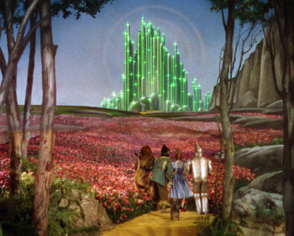
The Wizard of Oz (1939), IMDb
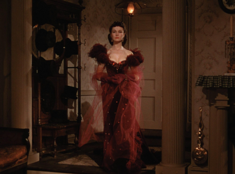
Gone with the Wind (1939), IMDb
Technicolour, though incredibly popular, was too expensive for widespread use, but still was used in films such as The Godfather (1973) and Susperia (1977). The switch from film reels to digital video amplified the importance of digital colour grading, creating new tones and vibrant colours to reach the heart and minds of new audiences.
I spoke to Mitch Paulson of Company 3 – a senior colourist who has worked with some of the most acclaimed filmmakers of the modern era on movies such as Blade Runner 2049 (2017), Skyfall (2012), Alien: Romulus (2024) and Smurfs (2025) – on his role in helping to create the look and feel of these projects. Paulson reflected on the increasing demand for colourists, noting that “now every movie has to have one. Even if it’s shot on film, someone still needs to grade the film for digital release. A colorist is a crucial part of the process and people are realizing that more and more.”

Blade Runner 2049 (2017), IMDb
To understand the importance of a colourist, it is necessary to understand what their job entails and how the process works in the modern film industry. Paulson noted that “as a colorist, it’s my job to help create the look that the director and DPs envisioned. It starts with developing LUTs (Look-Up Tables) for them to shoot with. Then once the material is in, I go through and make everything match and enhance the look that we already started creating with the LUT. I’ll get notes from the director, DP, producers, and address all of them.”
LUTs refer to the film’s colour template which can be directly applied to the footage, often used to set a predetermined look for a specific visual feeling as well as accelerate the speed of the colour grading process. Then, “once everyone is happy, we’ll start creating all the different versions of a movie that’s needed for deliverables. It’s my job to make sure the look carries through all versions.”
I asked Paulson what his favourite project has been so far, considering the range of his portfolio, and he answered with Blade Runner 2049 (2017) directed by Denis Villeneuve:
“What Denis Villeneuve & Roger Deakins [DP] did on that movie was simply amazing. I was very fortunate to collaborate with them on it. And it was the movie that Roger finally got his long overdue Oscar for cinematography […]
A movie like that, lots of people are involved with that process. From Denis & Roger to the production designers and Vfx team. The palette was something Roger created. It was my job to help get that on the screen. We had developed a LUT that Roger could shoot with and have the palette defined in it. Then we grade it all and do the finishing touches on it.”


Image by @colorpalettecinema
Here Paulson used a limited colour palette as imposed by Deakins, drawing upon contrasts between cool blues and fiery oranges to symbolise how technology (blues) is at odds with humanity (oranges). This use of colour heavily influences the audience’s emotions and perceptions, as well as acting as motifs within the film. All in all, Paulson helped to create one of the most visually beautiful films of the century with one of the most iconic colour grades in the history of cinema.
I asked Paulson what advice he would give to creatives interested in his line of work, and he said the following: “first thing I always tell people is you need to learn whatever tool you’re using, so well that when you’re working with a client, you don’t need to think about how you’re going to do something. It should be second nature […]
You want to be able to focus on creating the looks or addressing any notes that are given. A lot of the color grading software has free versions you can download and practice at home.”
